
Should food packaging design be understated or eye-catching? We made this guoba packaging "eye-catching"—the client was very skeptical, but the later sales results gave us a pretty good report card!
The guoba client is a very down-to-earth boss. When he came to me, he had just one request: no fancy frills, make it bold and grand. I said fine, but first let me ask you: your
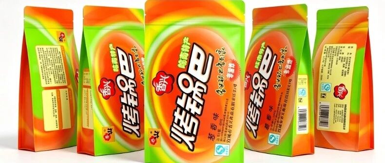
The client making guoba (crispy rice) was a very down-to-earth boss. When he came to me, he had just one request: don’t do any of that flashy, fancy stuff — make it grand, make it look like an award-winning piece, with a level of refinement worth appreciating.
I said, sure — but first let me ask you: where does your guoba sit on the shelf to sell?
He said supermarket shelves, plus small corner stores.
I said, then it has to be “flashy.”
He got anxious: why are you doing the opposite? I said flashy is a negative word, but flashy on the shelf is called “eye-catching.”
Think about it — guoba sits crammed on the same row of shelves as potato chips, crackers, and latiao. When a customer walks by and scans the row, their eyes don’t linger for more than three seconds. If your packaging is grand, plain, and tasteful, it’s invisible on the shelf; if it’s jumpy and attention-grabbing, the customer can fish it out at a glance. In the shelf business, the first battle is “being seen.”
What we ended up making: a high-saturation orange-to-green gradient color clash, glossy plastic laminated film bright enough to reflect light; the product name “Roasted Guoba” on the front in three-dimensional black-outlined type, popping out like a barrage of comments; and beside it a small red tag reading “Non-Fried.”
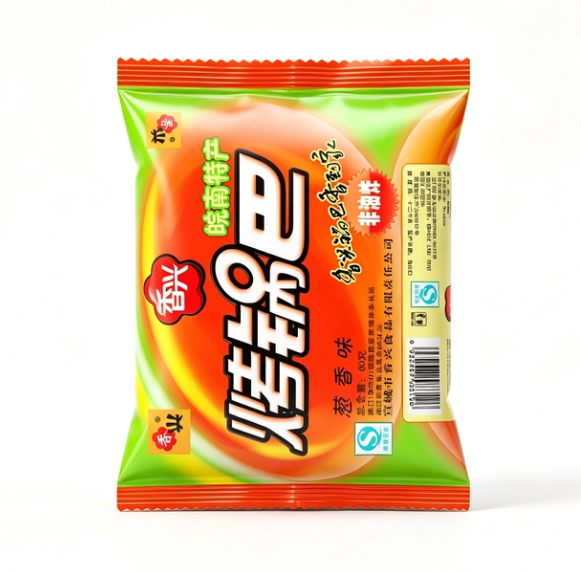
— Orange-to-green gradient packaging front view
When the client got the sample, his face turned green: this color scheme is way too tacky, isn’t it? Looks like street-stall goods.
I said don’t rush to curse me — find a supermarket, put it on the shelf, and stand ten meters away to look.
He actually went. When he came back, his attitude had changed: seems like… it really is the most noticeable one.
I said exactly. The difference between street-stall goods and a shelf bestseller isn’t who’s more “premium” — it’s who “fits.” Your guoba sells for 6 yuan a bag, and the target customers are students and young people binge-watching shows. What they want isn’t a premium feel — it’s the urge to “want to eat it the moment they see it.” Put that orange-green color clash there, and you can see it from two rows of shelves away — and that urge kicks in.
We deliberately chose that high-gloss film — the printed saturation gets boosted, and under the lights the whole bag shines. The client said it costs a bit more than a dime extra compared to ordinary film. I said that dime buys you that half second on the shelf.
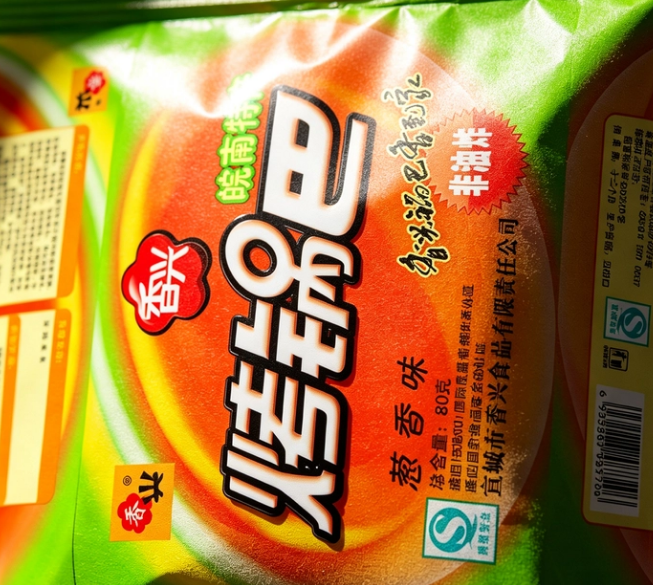
— Close-up of high-gloss printing on the packaging surface
Later he asked me again: should we put some health concepts on the packaging? No additives, traditional craft, that sort of thing.
I said don’t. People buying guoba are thinking “what can I munch on while binge-watching,” not “today I’m going to eat healthy snacks.” Tell them no additives and they go “oh”; tell them “crunchy and fragrant” and their mouth waters. In human purchasing, ninety percent of the time emotion strikes first — reason just helps find an excuse afterward.
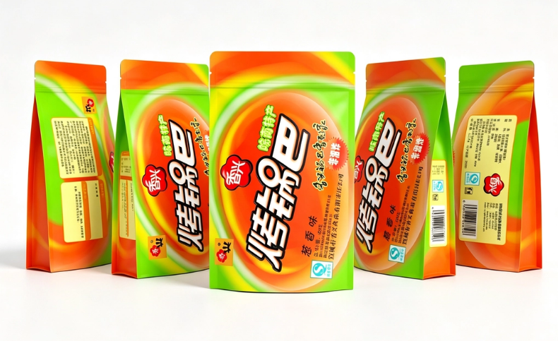
— Scattered guoba after opening the bag
This reminded me of a principle: in marketing, the biggest taboo is “educating the user.” No matter how good your product is, don’t corner the customer and lecture them. If the customer dreads hassle, help them save effort; if the customer fears choosing wrong, let them recognize it at a glance; if the customer wants to be happy, serve that “happiness” up to them first.
Doing business along the grain of human nature saves a hundred times the effort of shouting slogans against it.
Often clients see packaging I’ve designed based on the traits of the consumer group and say, this packaging is too tacky, and so on.
I say don’t — those two curses you throw at me are nothing compared to the goods you’ll sell.
Sanyao Packaging
Good packaging speaks for itself
About This Case: Quick Answers
How does a product actually get "seen" on the shelf?
Consumers give you only three seconds in front of the shelf. The most reliable approach is to design on two levels: from three meters away, grab attention with color and shape; within one meter, stop people with information and cultural trust signals. The root cause of most products not selling isn't that they're bad — it's that the "good" never gets shouted out from three meters away.
Can my food product use this "eye-catching" approach too?
Yes. This logic doesn't discriminate by category — as long as your product stands on the shelf looking like everyone else's and consumers can't recognize you in three seconds, it works. When it comes to execution, we'll redefine the plan based on your category, channel, and price tier, rather than forcing someone else's face onto yours.
What do you typically charge for food packaging, and how long does it take?
We bill per project, depending on category complexity, the number of SKUs in the series, and whether prototyping and extensions are included. Typically 2–4 weeks: week one sets direction and positioning, week two delivers the proposal, and weeks three and four deepen, prototype, and finalize. Rush timelines can be compressed, but we recommend leaving time for physical prototyping. Send us your materials for a free diagnosis before we quote.
We're based elsewhere — can we collaborate online?
Yes. Many of our projects are remote collaborations: materials coordinated online, proposals reviewed in the cloud, and prototypes shipped by courier. There are no geographic limits — we work with clients nationwide.
CommentsBe kind, communicate rationally