
Many people know that in the FMCG category, plenty of products become breakout hits—and the power of packaging should not be underestimated! Take this corn juice packaging from Fujian, for example!
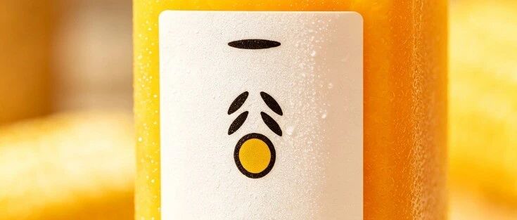
Yigu Yang corn juice packaging case: generous white space with a red seal, condensation droplets, and a genuine sense of companionship in breakfast scenes.
Let me start with an observation you’ll probably recognize: young people today increasingly don’t buy based on “specs.”
On supermarket shelves, it’s zero sugar, zero fat, high protein, dietary fiber — each bottle outdoing the next. Yet the one consumers finally pick up in front of the cooler is often not the one with the prettiest ingredient list, but the one that “looks right,” “feels good in the hand,” “photographs well for a Moments post.” Coffee drinkers aren’t after caffeine — they’re after that feeling of “I’m living deliberately.” Flower buyers aren’t after vase life — they’re after the mood of “I’m having a good day today.”
Applied to beverages, the logic is the same: young people aren’t buying “thirst-quenching” — they’re buying “being taken care of in this moment.”
I recently studied a bottle of corn juice from a brand called “Yigu Yiyang” — a 300ml small bottle, frosted plastic, a vertical label with black text on a white background, and a beige cap. Honestly, it’s not the type that stuns you at first glance, but it has a high survival rate on the shelf. What I want to talk about today is how this bottle of corn juice survives in two real scenarios by relying on “emotional value.”
01
Scenario one: In front of the cooler, that layer of condensation speaks for it first
At 7:30 in the morning at a convenience store, the cooler door opens and white mist spills out. Rows of drinks stand side by side, all beaded with water droplets — but only some bottles make you want to reach out.
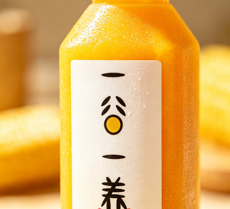
— Corn juice — close-up of condensation
Look closely at this image. Against a warm yellow corn background, the bottle of corn juice has a fine layer of condensation beading on its surface, drop by drop, as if it were just pulled from ice water. The frosted body amplifies the effect: no glare, the droplets clearly visible on it, and through the cooler glass — before you’ve even picked it up — you “feel” the cold.
This is the packaging’s first little trick: it doesn’t tell you “what I’ve added,” it simply lets you see “I’m cold, I’m fresh.” In the drowsiness of an 8 a.m. start, this tactile suggestion works better than any slogan.
The label is restrained too. White background, black text, vertical layout, one clean line — “Fresh-Pressed Corn Juice,” net content 300mL. No flashy illustrations, no big banners shouting “nutrition” or “health.” At first I thought the packaging was too plain — so plain it didn’t look like a serious beverage. Then I figured it out: the morning shelf is already noisy enough, every bottle shouting “Look at me! Look at me!” — and this one standing quietly actually stands out.
How do you make people stop? Not by shouting, but by that visible layer of condensation.
02
Scenario two: By the window, that bottle lit by sunlight — a “little happiness”
After you buy it, the packaging’s job isn’t done.
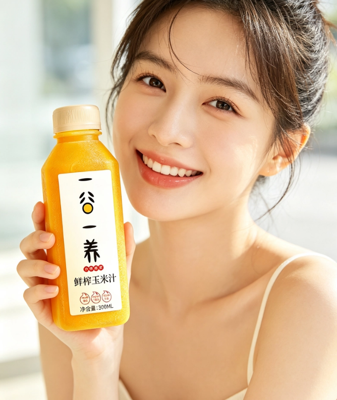
— Corn juice — held by the window
I stared at this photo for a long time. A young woman with a ponytail, in a white camisole, stands by a bright window; sunlight pours in, and she smiles as she holds the bottle of corn juice — beige cap, white label, held in her hand, the scene as clean as a lifestyle snapshot.
Notice there’s none of that ad exaggeration — “one sip and you’re energized all day.” It’s just an ordinary girl drinking a bottle of corn juice in the morning. But it’s precisely this “ordinary” that is the core of emotional value: what it conveys isn’t “what happens when you drink it,” but “this is what my morning looks like” — relaxed, bright, orderly.
How do you sustain the emotion? By putting the bottle into “the right frame.” By the window, sunlight, white camisole, ponytail — this is exactly the kind of scene a young woman would photograph and record herself. Once the bottle enters her lifestyle photo, it enters her social circle; a friend asks “What’s that?” and a free word-of-mouth plug is done.
At this point, the packaging is no longer packaging — it’s a prop.
03
Scenario three: Those “moments of being put on display”
The corn juice photos also include a wonderful set of scenes: an orange-and-purple stepped display stand, with corn kernels and geometric shapes scattered in the background; and another set built from orange geometric cardboard into a three-dimensional space, a marble-patterned countertop, sunlight slanting in, shadows sharp.
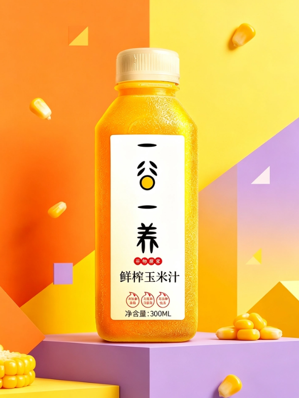
— Corn juice — orange-and-purple stepped display stand
These images aren’t shot for people who “buy it to drink” — they’re shot for people who “display it because it looks good.” Convenience store owners will display it, afternoon-tea shops will display it, the photo-sharing crowd on Moments will display it. Whether a bottle looks good is sometimes decided not by the drinker but by “the displayer” — only when the displayer feels it has style can it enter more people’s field of view.
A fun fact: while going through the materials, I noticed the corn juice’s screw cap comes in both beige and orange across different versions. Was that a mistake or intentional? I’m not sure. But beige is gentle and orange is lively — the same bottle with a different cap can match the tone of different scenarios. That kind of detail understands business better than a unified logo.
04
Emotional-value packaging comes in roughly four types
After studying this bottle of corn juice, I tried to categorize “emotional-value packaging.” It’s not necessarily exhaustive, but it’s roughly enough:
1) Tactile type: suited to cold drinks, dairy, juice. The core is making “cold,” “fresh,” and “smooth” visible and tangible — condensation, frosted texture, icy color schemes all follow this approach. The selling point is “the feeling of that instant.”
2) Visual type: suited to coffee, tea drinks, sparkling water. It uses color and layout to create an “atmosphere” — whether it’s minimalist, dopamine, or retro determines who will put it into their lifestyle photos. The selling point is “looks good on Moments.”
3) Scenario type: suited to products for specific moments like breakfast, overtime, or exercise. The packaging directly anchors to a concrete scenario — the morning convenience store, the afternoon office, the evening gym — so consumers “think of it right on cue.” The selling point is “companionship.”
4) Memory type: suited to products with a sense of place or a story. It relies on a symbol, a color, or a line of dialect to make people remember “where it comes from.” The selling point is “identity.”
Notice that all four types share one thing: they don’t solve the functional problem of “thirst” — they solve the problem of “what feeling did I want at that moment.” And once a feeling is satisfied, repeat purchase and sharing come along for free.
05
A word of honesty
At 7:30 in the morning at a convenience store, the cooler door opens and closes dozens of times a day. What gets a bleary-eyed person to pull you out from a row of drinks isn’t the words on the ingredient list — it’s that layer of condensation, that beam of sunlight, that moment of “being taken care of.”
Emotional value sounds abstract, but in practice it comes down to these concrete things.
Next time you pass a convenience store, try this: don’t rush to grab the one you usually drink. Stand in front of the cooler for two extra seconds and see which bottle, just by looking at it, makes you feel “today’s not bad.”
Sanyao Packaging
Good packaging speaks.
About This Case: Quick Answers
How exactly does a product get "seen" on the shelf?
Consumers give you only three seconds in front of the shelf. The most reliable approach is to design in two layers: from three meters away, grab attention with color and shape; within one meter, stop people with information and cultural trust signals. The root cause of most products not selling isn't that they're bad — it's that the "good" never gets shouted out from three meters away.
Can my beverage product use this "One Grain, One Nourishment" approach too?
Yes. This logic isn't picky about category — as long as your product looks like everyone else's on the shelf and consumers can't recognize you in three seconds, it works. When it comes to execution, we'll set a new plan based on your category, channel, and price band, rather than forcing someone else's face onto yours.
What do you typically charge for beverage packaging, and how long does it take?
We charge per project, depending on category complexity, the number of SKUs in the series, and whether prototyping and extensions are included. Typically 2–4 weeks: week one sets direction and positioning, week two delivers concepts, weeks three and four refine, prototype, and finalize. Rush timelines can be compressed, but we recommend leaving time for physical prototyping. Send us your materials for a free diagnosis before we quote.
We're based out of town — can we work together online?
Yes. Many of our projects are remote collaborations: materials shared online, concepts reviewed in the cloud, prototypes shipped by courier. There's no geographic limit — we work with clients nationwide.
CommentsBe kind, communicate rationally