
Can baijiu packaging design from Northeast China feel a little different? One small blue bottle offers an answer for a new consumer brand
Case study of Beifang Lidu 235 craft baijiu: an all-blue bottle with a snowflake symbol, and how a new category used color and a velvet gift box to go from a viral hit to lasting success.
When will the first snow arrive? Northerners watch the sky; southerners watch their social feed.
Building a brand is actually a lot like waiting for snow: those who arrive early seize the moment; those who arrive at just the right time light up the whole internet; but the truly hard part is that after the snow melts, you’re still standing there.
In the baijiu world these past couple of years, there’s no shortage of “overnight fame” stories. A new liquor launches, catches some moment, gets pushed by short videos, gets shared across social feeds, and the first wave sells out. But look again three months later: the buzz is gone, repeat purchase has dried up, and your spot on the shelf has been taken by another brand. A strong start and a weak finish is practically the fate of new-consumption liquor. And so the old questions come back: in a red-ocean bloodbath, how do you win? Why is it easy for so many new brands to go viral but hard to stay on top? And in those rows of red-and-gold baijiu on the shelf, is there really still room for a new brand?
I recently studied a little liquor called “北方栗度235” (Beifang Lidu 235), and I’d like to use it to talk about these things.
01
How does a small brand squeeze its way onto the baijiu shelf?
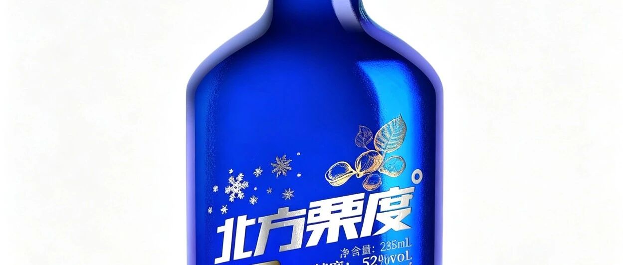
First, look at what it looks like: a blue transparent glass bottle, a gold cylindrical cap, with silver-white snowflakes and chestnut fruit patterns hot-stamped on the body, 235 ml net content, 52 proof. Honestly, dropped into a pile of baijiu, it’s recognizable at first glance—because the entire shelf is a red-and-gold system, and it’s stubbornly blue.
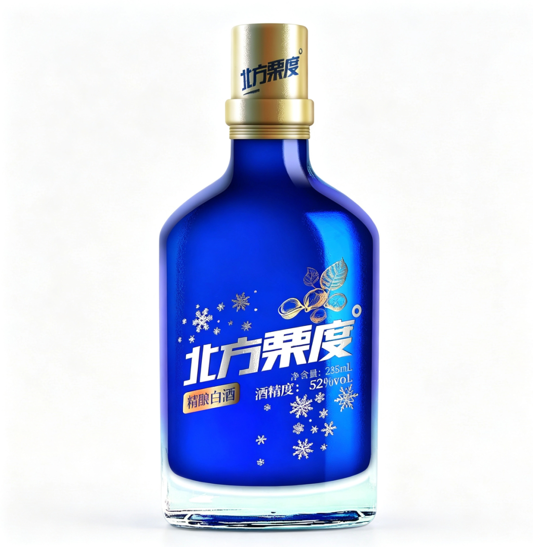
— 北方栗度235-白背景产品图
Why does it dare to be so “blue”? Break it down, and four conditions come together.
First, color is remembered before the name. Baijiu packaging has been in a arms race for decades; red = festive, gold = premium, and that became the industry default. But precisely because everyone is competing in red and gold, blue becomes the scarcest visual asset. Consumers can’t remember the four characters “北方栗度,” but they can remember “that blue bottle.” The first step of symbolic value is making your color become your name.
Second, the small format lowers the barrier to trial. At 235 ml—less than half a jin—the price threshold is low. A new brand has no trust endorsement from an old brand; getting consumers to spend several hundred on a large bottle of something they’ve never heard of is too hard. But spending a little to try a small bottle isn’t hard. A small format isn’t “not grand enough”—it’s giving new customers a low-cost chance to say “I’ll give it a try.”
Third, the category narrative connects to the place of origin. North, chestnut, chestnut fruit, snowflakes—this set of names and symbols wasn’t chosen at random. It tells a story of “from the north, chestnut-flavored, a warm cup in the freezing cold.” A brand can lack history, but it can’t lack a place it comes from. Origin is the cheapest trust signal a new brand has.
Fourth, the display setting stands up for it. This bottle isn’t just shot as a “white-background ID photo”; it also appears in a blue LED freezer, among ice cubes and obsidian—cold, clean, with a sense of technology. Placed in liquor channels, it doesn’t look like baijiu; it looks like craft beer, like whiskey—and that “crossover feel” itself is the memory hook for young people.
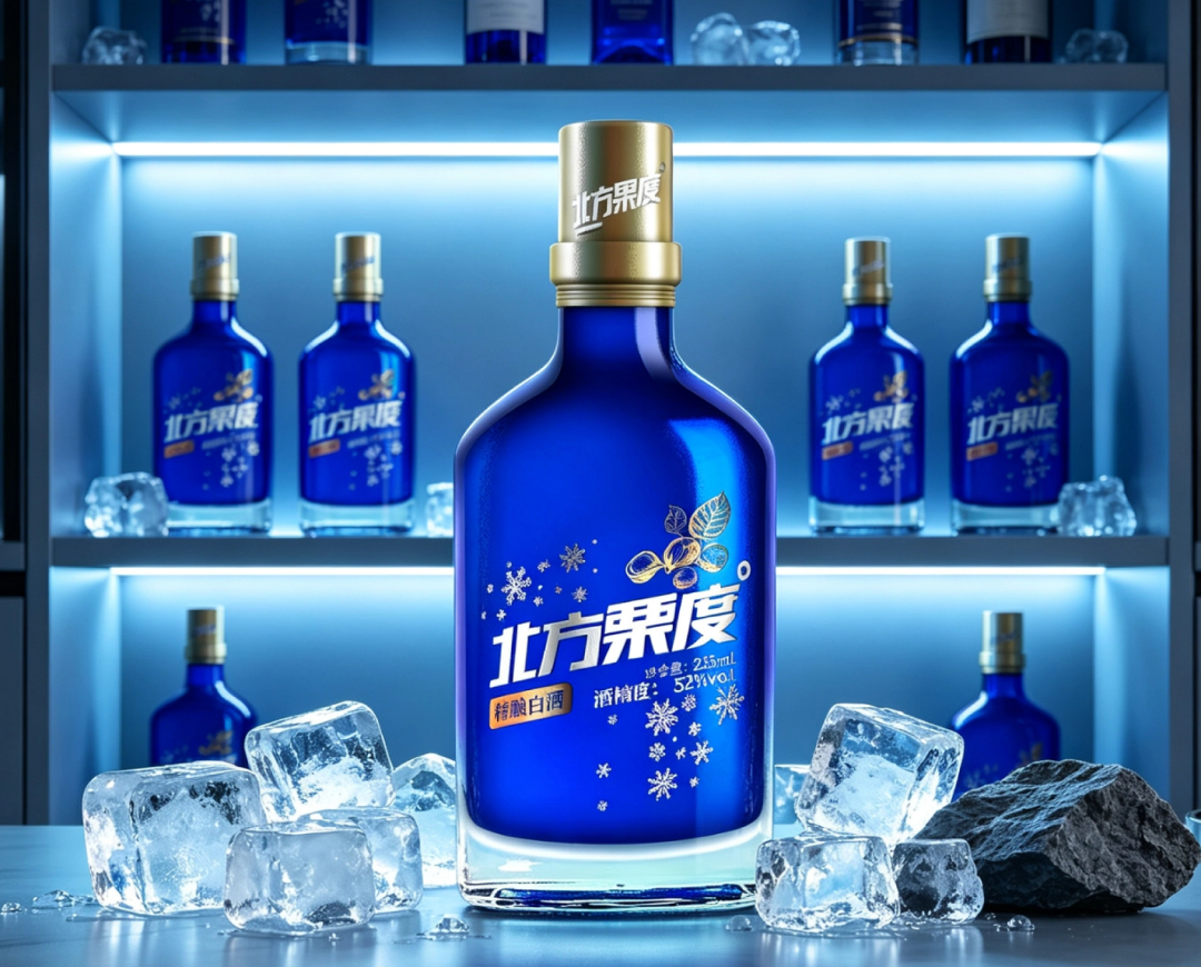
— 北方栗度235-冰柜冷冽场景
With all four conditions in place, a new brand completes the “zero to one” ice-breaking. But “one to one hundred” is the harder stretch.
02
From viral to lasting: all five paths have to be walked
The most common way new-consumption brands die is that they can’t catch the ball after going viral. The first wave of traffic feeds them, the second wave has no buyers, and the problem is that they only made a “hit product” and never built a “system.” I’ve mapped out five paths, and 北方栗度235 touches on each one:
First, the product itself has to hold up. No matter how good the packaging looks, if the liquor tastes bad, the repeat purchase rate will teach you a lesson. This liquor’s foundation is “craft baijiu”—52 proof, small bottle, following the “drink less, drink better” route. It doesn’t package itself as “a gift for others” but as “your own daily pour,” and that positioning in itself avoids the most crowded track of gift-box liquor.
Second, symbols must be used all the way through, not just once. The blue bottle, the hot-stamped snowflakes, the gold cap—this set of symbols doesn’t appear only on the bottle. Look at the gift box version—a deep-blue gift box, lined with silver-gray jacquard crepe velvet, accented with gold snowflakes and rhinestones; open the lid and the velvet cradles that blue bottle, like opening a box of snow. When symbols extend from the bottle to the gift box and to every motion of unboxing, only then has the brand truly “grown into consumers’ minds.”
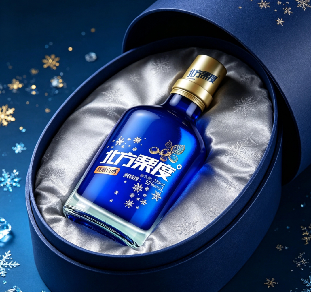
— 北方栗度235-丝绒礼盒开箱
Third, give the product a “scene.” Going viral depends on luck; lasting depends on scenes. Snowflakes, frost, blue—this visual language naturally points to “iced,” “snowy night,” “gathered around the fire.” When consumers think “it’s cold, let’s have a cup” and think of this blue bottle, it no longer needs to advertise from scratch every time—the scene advertises for it.
Fourth, the gifting scene is a hurdle baijiu can’t avoid. Half of baijiu sales are in gift boxes. 北方栗度235 doesn’t dodge this; it offers a non-red-and-gold answer with a “blue velvet gift box”—when you’re tired of giving red and gold, a box of “ice-snow blue” feels fresh instead. That moment of ritual when you open the box is the most valuable part of gift-box liquor.
Fifth, and hardest: don’t rush to chase the next hit. Many brands go viral once and then rush to copy the path and make a second hit, and in the end neither lasts long. 北方栗度235’s approach is to guard one color, one symbol, one category, and go deep with the blue bottle—single bottle, gift box, display, scene, all revolving around this one set of symbols. It’s clumsy, painstaking work, but lasting success is exactly what that clumsy work buys.
03
A slightly unpleasant thing to say
I’ll admit it: zoom in on the images, and this liquor’s craftsmanship isn’t “flawless.” Against a pure white background it looks premium, but stuffed into that row of freezers on the shelf, under the blue light, the gold cap reflects purple and doesn’t look as “expensive” as the official shots. But this is exactly the mindset a new-consumption brand should have—not waiting until everything is perfect before stepping on stage, but stepping on stage first with a clear symbol, then fixing it bit by bit on the real shelf.
Of the batch of new-consumption brands that were hot five years ago, few are still standing on the shelf today. The survivors aren’t the ones with the loudest buzz back then; they’re the ones with the clearest symbols, the most concrete scenes, and products that could withstand repeat purchase.
Snow always melts. The difference is that some people wait for the next snowfall, while others have already put down roots in the snow.
Five years from now, when you walk into a liquor store, take a look at that row of baijiu on the shelf—whether the blue bottle is still there is the answer.
Sanyao Packaging
Good packaging speaks
About This Case: Quick Answers
My product is good, but why should consumers believe it?
Trust is grown, not shouted. Break trust down into visible details: real ingredients, restrained claims, traceable symbols of origin. The less you boast about a feature, the more buyers reach the conclusion themselves that "this thing is reliable."
Can my baijiu product use the "baijiu isn't just for shooting" approach too?
Yes. This logic doesn't discriminate by category—as long as your product sits on the shelf looking like everyone else's and consumers can't recognize you in three seconds, it works. When it comes to execution, we'll define a new plan based on your category, channel, and price band, rather than forcing someone else's face onto yours.
If I hire you for baijiu packaging, how do you usually charge, and how long does it take?
Billed per project, depending on category complexity, number of series, and whether prototyping and extensions are included. Typically 2–4 weeks: the first week sets direction and positioning, the second week delivers concepts, and the third and fourth weeks deepen, prototype, and finalize. Rush jobs can be compressed, but we recommend leaving time for physical prototyping. Send your materials for a free diagnosis first, then we'll quote.
We're based out of town—can we collaborate online?
Yes. Many of our projects are remote collaborations: materials coordinated online, concepts reviewed in the cloud, prototypes shipped by courier. There are no geographic limits—we work with clients nationwide.
CommentsBe kind, communicate rationally