
Mao Mao believes that a distinctive liquor shouldn't use a traditional bottle—find your own shadow, create something novel and unconventional, and you'll have a better chance. Fruit wine packaging done right—what I want to talk about isn't looking good
Back when I was doing packaging for papaya wine, my girlfriend asked me: do you designers make a living just on "looking good"? I thought about it and said no. Looking good is only the passing grade; the real
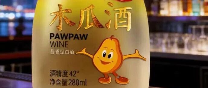
When I was working on the packaging for a papaya wine, my girlfriend asked me: do you designers make a living just off “looking good”?
I thought about it and said no. Looking good is only the passing grade. The truly hard part is getting the packaging to actually talk to people.That papaya wine—the client was a small distillery that had been in business for over a decade, always selling wholesale, with no brand of its own. The owner wanted to pivot to retail, targeting young women from their twenties to early thirties—the kind of girl who, on a weekend night, opens a small bottle of wine to go with a show.
The moment he mentioned the target customer, I had a clear picture: this packaging couldn’t be the big-red-and-green traditional fruit wine look, and it couldn’t go the medicinal-liquor route either. It had to lean into “soft”—warm yellow tones, an illustrated feel, like a romance movie poster.
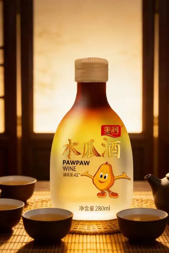
— Front photo of the warm-yellow small square bottle
I drew a papaya with a woodblock-print texture—not the polished look of a styled fruit photo, but lines with a bit of hand-drawn warmth, on a warm yellow background with plenty of white space. The bottle became a small square bottle you can hold in one hand, with a frosted texture that feels warm to the touch. On the shelf, next to those fruit wines with labels plastered all over, it sits quietly like something from another category.
But there was one very specific task in the middle of all this that nearly did me in: the information on the bottle label.
The client insisted on printing “Papaya Wine,” “Net Contents,” “Alcohol by Volume,” and a line reading “Traditional brewing, beautifies and warms the body” on the front. I counted—seven lines of text, and the front simply couldn’t fit it all. He got anxious and said all of it had to be there, or customers wouldn’t look.
I said, let’s run an experiment: you be the customer. Stand in front of the shelf for three seconds and see which bottle makes you stop?
He talked tough, but he came to the supermarket with me anyway. When we got back he said: you’re right, I looked at the one with the most information and couldn’t make out a word of it.
In the end we cut the front down to just the three characters “Papaya Wine” plus a small icon, and moved everything else to the back and side labels. After it went on the shelf, he turned the sample over and over in his hands for a long while, then said: strange—with less information, I actually feel like this wine is more trustworthy.
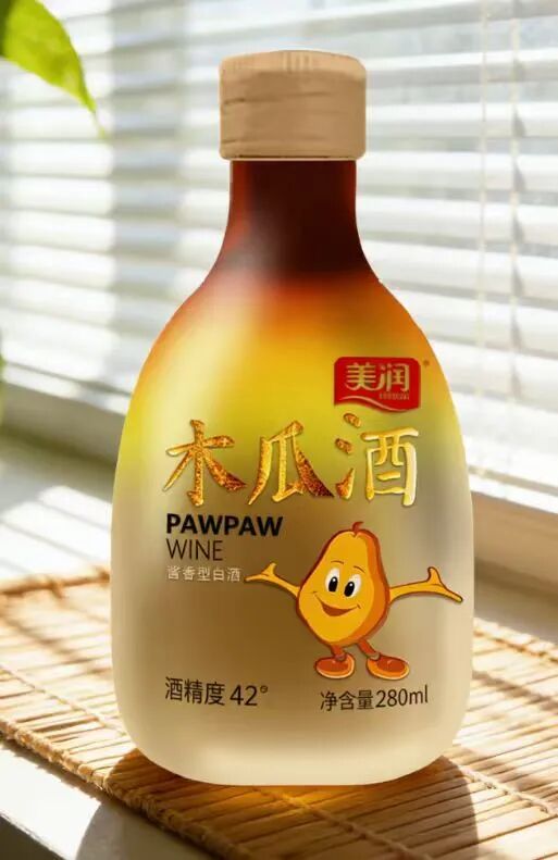
— Photo of light-and-shadow detail on a bamboo-woven mat
I guess this is the difference that “who you’re talking to” makes. For a wine meant for young women, what she wants at first glance is atmosphere—the gut feeling that “this bottle gets me”—not an ingredient list. It’s not that information doesn’t matter; it’s that it has to be told at the right moment. The front of the packaging is doing the job of saying hello; the back is doing the job of making the case. The two have to be handled separately.
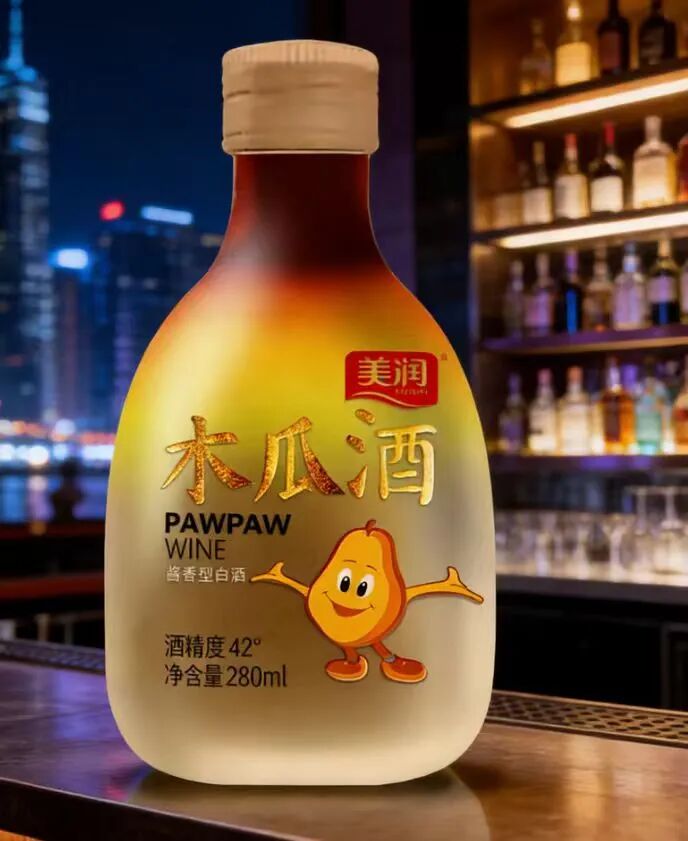
— Photo of a bar counter scene
Later, the buyer-show photos were all girls holding up the bottle to take pictures, with captions like “the bottle is so pretty, I can’t bear to throw it away after drinking—it’s decoration now.” He sent me screenshots, and I replied with a smug emoji, though deep down I knew: that comment wasn’t praising how beautiful the design was—it was praising the fact that he’d said the right thing to the right person.
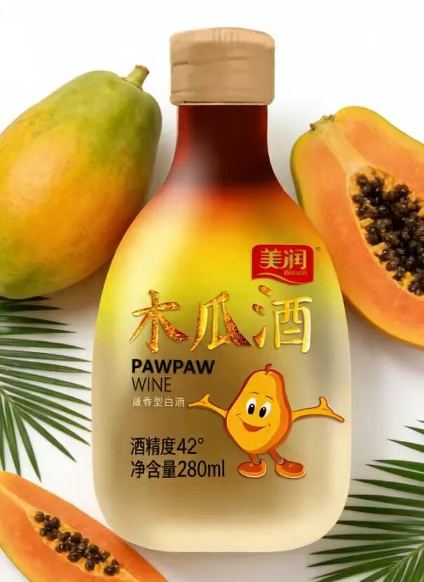
— Close-up photo of the papaya and the bottle
In this packaging line of work, the proposals can vary endlessly, but the underlying thing never changes: you first have to figure out clearly who’s standing across from you, and what you want to talk to them about. Once that’s clear, the visuals come naturally.
Sanyao Packaging
Good packaging speaks
About This Case: Quick Answers
How does a product actually get "seen" on the shelf?
Consumers give you only three seconds in front of the shelf. The most reliable approach is to design on two levels: at three meters, grab attention with color and shape; at one meter, stop people with information and cultural trust signals. The root cause of most products that don't sell isn't that they're bad—it's that the "good" never gets shouted out from three meters away.
Can my baijiu product use the "The baijiu gets me" approach too?
Yes. This logic doesn't discriminate by category—it works as long as your product looks like everyone else's on the shelf and consumers can't recognize you in three seconds. When it comes to execution, we'll build a new plan around your category, channel, and price band rather than forcing someone else's face onto yours.
If we hire you for baijiu packaging, how do you usually charge, and how long does it take?
We charge per project, depending on category complexity, the number of series, and whether prototyping and extensions are included. Typically 2–4 weeks: the first week sets direction and positioning, the second week delivers concepts, and the third and fourth weeks deepen, prototype, and finalize. Rush timelines can be compressed, but we recommend leaving time for physical prototyping. Send us your materials for a free diagnosis before we quote.
We're in another city—can we collaborate online?
Yes. Many of our projects are remote collaborations: materials coordinated online, concepts reviewed in the cloud, and prototypes shipped by courier. There are no geographic limits—we work with clients nationwide.
CommentsBe kind, communicate rationally