
Differentiation and Personalization in Sunflower Seed Packaging Design: A Discussion of Scenario- and Situation-Based Packaging Design Approaches!
I've noticed a shift in today's snack foods: what people are buying is no longer "the sunflower seeds themselves," but "the vibe of cracking sunflower seeds." A bag for binge-watching, one for camping
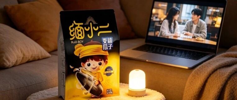
I’ve noticed a shift in the snack food space: people are no longer buying “the sunflower seeds themselves” — they’re buying “the vibe of cracking sunflower seeds.” A bag while binge-watching a show, a bag while camping, a bag while gaming — the seeds are still the same seeds, but the moment the packaging starts to “get the scene,” it wins.
Today I’m breaking down a guochao-style sunflower seed brand called “缅小二” (Mian Xiao’er). Going through six real-life photos, I found that from start to finish it never talks about “fragrant seeds, big kernels” — it’s all about “who, in what scene, happily cracking seeds.” This playbook is worth copying for every snack food brand.
01
Step one: use a “person” instead of a pile of adjectives
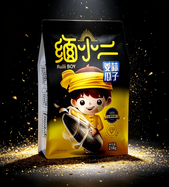
— 缅小二 key visual packaging
First, the key visual. On a bag that fades from black to yellow, a cartoon figure in yellow clothes hugs a sunflower seed bigger than his own head, grinning wide. Golden sparkles are scattered across the background, with the brand name, flavor, and net weight alongside.
The smartest thing about this design is that it “personifies” the brand. 缅小二 isn’t a cold logo — he’s a specific “person”: a goofy, slightly silly guy happily hugging his sunflower seeds. When consumers see this figure, they don’t need to read a single line of copy to feel the brand’s personality: down-to-earth, joyful, unpretentious.
You might think “personification” is an old trick. But look at the details — the way the figure hugs the seed turns “sunflower seeds” into part of his own body, and the entire visual focus lands on “the joy of eating sunflower seeds,” not “how fragrant the seeds are.” This is selling emotion, not selling product.
02
Step two: let the packaging “walk” into the scene on its own
What struck me most about this case is that its real-life photos are almost all “scene shots,” not product shots. I counted: five of the six images are real-life scenes:
One is placed on an office desk, next to a cup of coffee and a few macarons, with a blurred office area in the background — this is the afternoon-tea slacking-off moment;
One is spread on a yellow-and-white checkered picnic blanket, next to sandwiches, lemon tea, and colorful balloons, with outdoor greenery in the background — this is the weekend picnic moment;
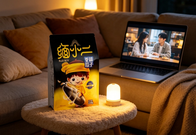
One stands on a felt round table, with a warm-lit sofa and a laptop screen still glowing — this is the late-night binge-watching moment;
One sits in a wooden multi-compartment nut tray, next to pistachios and pecans, along with two retro handheld consoles — this is the party gaming moment.
— 缅小二 picnic scene
See — it doesn’t say “our sunflower seeds suit every occasion”; it uses the images to tell you directly: office, picnic blanket, sofa, gaming table — 缅小二 is everywhere. What consumers see is “that happy little guy hugging his sunflower seeds has shown up in everyday life, just like mine” — this sense of immersion is more effective than ten lines saying “versatile for any scene.”
Honestly, many brands want to do this kind of “scene-based real-life shooting,” but somewhere along the way it turns into “a model holding the product and smiling.” What’s the difference? The difference is whether there are “traces of life” in the frame — the office desk should be messy enough to have coffee stains, the picnic blanket shouldn’t be laid out too neatly, the binge-watching lighting should actually be dim. 缅小二’s photos are exactly this kind of “traces of life” imagery.
03
Step three: use a sense of matrix to build “readily available” trust
The last image is interesting: eight bags of sunflower seeds, two rows and four columns, neatly arranged against a dark gray background, with the lighting specifically highlighting the front packaging.
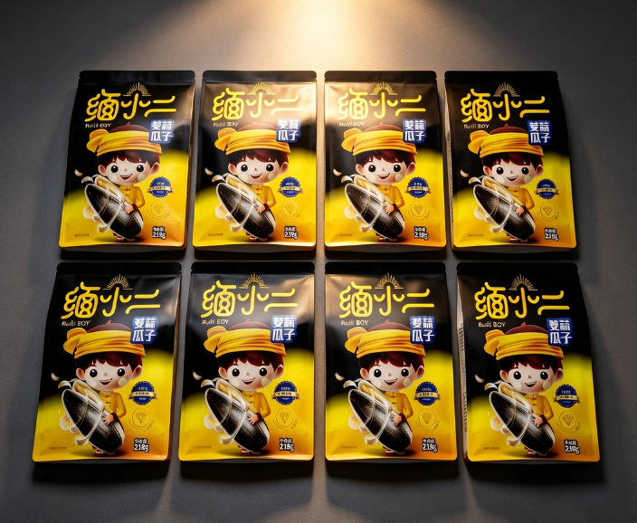
— 缅小二 matrix display
This image isn’t for looking pretty — it’s to convey one thing: we have a complete product line covering all flavors and all scenes. The black-and-yellow contrasting colors unify the visual, and every bag is the same “缅小二,” but if you look closely, the flavors and selling points are differentiated — the spicy one has a spicy packaging temperament, the five-spice one is more mellow.
When consumers stand in front of the shelf and see a whole row of unified yet individually distinct 缅小二, the first thing that pops into their heads is: “This brand is pretty comprehensive — whichever bag I buy, I won’t go wrong.” The trust built by this “sense of matrix” is far greater than the trust built by a single bag. This is also why many snack brands frantically expand their SKUs once they get popular — it’s not for fun, it’s forced by shelf logic.
04
A word of honesty
缅小二’s packaging, put plainly, comes down to one sentence: Don’t sell sunflower seeds — sell the happy scene of cracking sunflower seeds.
The sunflower seed category simply can’t differentiate itself through ingredients — you say your kernels are big, the brand next door says the same; you say yours are fragrant, everyone’s are fragrant. The only way to stand out is “who can enter the consumer’s life picture first.” 缅小二 did this with one little figure and five scene photos.
Next time you design snack food packaging, don’t rush to write “selected ingredients, plump in every kernel.” First think: at which moment in the consumer’s life should my product appear most? Then paint that moment onto the packaging and shoot it into the promotional images.
Get the scene right, and consumers will come naturally. (Content generated by AI, for reference only)
Sanyao Packaging
Good packaging speaks
About This Case: Quick Answers
Can my food product use the same playbook as "Mian Xiao'er"?
Yes. This logic isn't picky about category—it works as long as your product looks like everyone else's on the shelf and consumers can't recognize you in three seconds. When it comes to execution, we'll build a new plan around your category, channel, and price band rather than forcing someone else's face onto yours.
If I hire you for food packaging, how do you usually charge, and how long does it take?
We charge per project, based on category complexity, the number of series, and whether prototyping extensions are included. Typically 2–4 weeks: the first week sets direction and positioning, the second week delivers concepts, and the third and fourth weeks deepen the work through prototyping and finalization. Rush timelines can be compressed, but we recommend leaving time for physical prototyping. Send us your materials for a free diagnosis first, then we'll quote.
We're in another city—can we collaborate online?
Yes. Many of our projects are remote collaborations: materials coordinated online, concepts reviewed in the cloud, and prototypes shipped by courier, with no geographic limits. We work with clients nationwide.
Is packaging a cost or an asset?
It's pricing power. Treat it as a cost to cut, and it gets clawed back from your selling price; treat it as an investment, and it tells your story of value before consumers even reach for their wallets. Great packaging does just one thing: it makes the product look—and genuinely be—worth that price.
CommentsBe kind, communicate rationally