
A bottle of yangmei wine—how does it dare to sell at this price?
I stood in front of the fruit wine shelf for ten minutes, and I picked up the plainest-looking bottle. How does it go from around twenty-something yuan to more than double? The answer is all in the packaging.
Last month I went to the supermarket with a friend, and I stood in front of the fruit wine shelf for ten minutes.
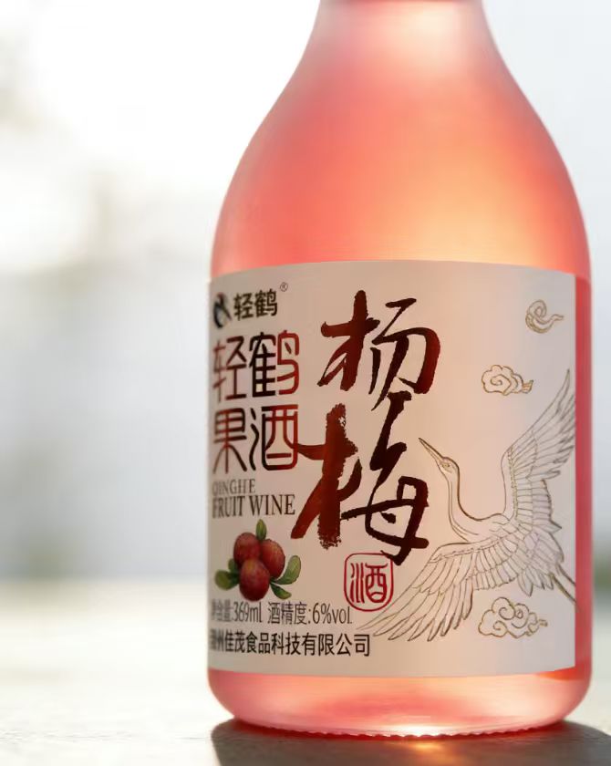
A whole row, over a dozen brands, each one trying to outdo the others in flashiness: illustrations more and more crowded, color schemes more and more garish, as if they wanted to print the entire orchard onto the label. But the one that actually made me reach out was the plainest-looking bottle of them all—an off-white background, the two characters “Yangmei” written in brush calligraphy, a single line-drawn crane, and nothing else.
This bottle is one we made for a client: Qinghe Fruit Wine.
A friendly note for readers: this article is about 1,100 words, roughly a 3-minute read. You’ll see: real observations from the fruit wine shelf, the design decisions that took this bottle from unsellable to double the price, and the return-on-investment math for one packaging cost.
When the owner first came to me, design wasn’t actually what was worrying him. He makes yangmei wine—good fruit, Dongkui yangmei, and the wine is properly fermented—but the retail price just wouldn’t budge; at twenty-something yuan he still had to watch people’s faces. His exact words were: my wine is no worse than anyone’s, so why can’t it sell for a price?
I said, your wine isn’t the problem—the problem is your wine doesn’t speak on the shelf.
(As an aside, a lot of owners understand packaging as “beautification,” as if packaging were putting makeup on a product. Actually, packaging is a salesperson—one you don’t even have to pay.)
That day we didn’t rush to start drawing. We did something dumb first: we went to the supermarket to look at the shelf.
And as we looked, a pattern emerged: this fruit wine shelf is almost entirely crammed into two lanes—either Japanese-style minimalism or guochao illustration style, with the visuals piling up more and more. Take a photo of a row of bottles and shrink it to thumbnail size, and it’s a blur—everyone looks like everyone else.
In front of the shelf, the consumer actually gives you only three seconds. If they can’t recognize you in those three seconds, everything after that is off the table.
So our decision was to go the opposite way: everyone else adds, we subtract.
Everyone else adds, we subtract
In the end, only three things were left on the label.
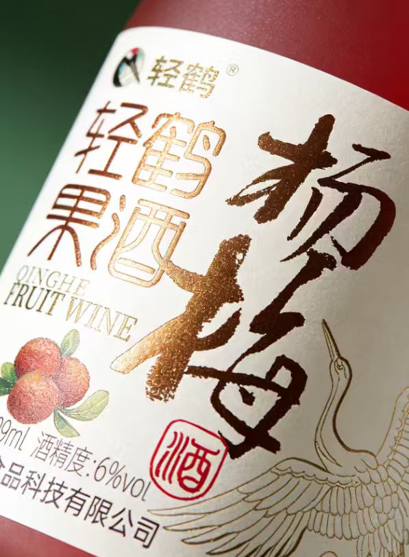
The large calligraphic characters “Yangmei,” written with a real brush, not an art font from a computer typeface. The strokes hold a bit of wildness—it suits the yangmei fruit. From three meters away, you see these two characters first; the category needs no explanation.
A crane, a fine-line drawing, as delicate as if embroidered with a needle. This isn’t a decoration added on a whim—the brand is called “Qinghe” (Light Crane), and we painted the brand directly onto the bottle. The owner used to always grumble that “consumers can’t remember my brand”; now the crane is on the bottle, and it’s hard not to remember (he didn’t even expect this himself, and afterward he told everyone he met).
And a single red seal, with the character “Jiu” (wine). A tiny square of red—the entire label’s sense of trust rests on it. In Eastern eyes, anything with a seal on it is something that counts.
Now for the craft—the part the client was most reluctant to spend money on at first.
For the calligraphy and the crane, we insisted on hot foil stamping. During the proofing, he thought it was too expensive—foil stamping is an extra process, adding several tenths of a yuan to the cost. I had him hold the proof and feel it—after he felt it, he said nothing. Characters on paper and characters in gold: one is a drawing, the other is merchandise. Under the counter lights, those two characters light up on their own—you can see them from two shelves away.
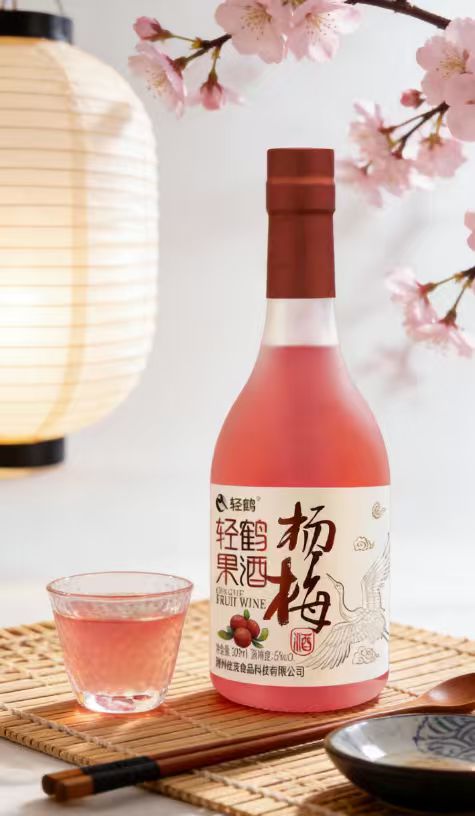
There’s another detail: the bottle is frosted. The frosting isn’t for a comfortable feel—it’s to let the yangmei pink of the wine show through, but not too directly, a hazy layer. The best advertising color for this bottle is actually the wine itself; we just didn’t block it.
If you can’t be seen from three meters away, you don’t exist
What happened afterward is even more interesting than the design itself.
This bottle’s retail price is now more than double what it was, and its channels have shifted from mom-and-pop shops to boutique supermarkets and restaurants. The most tangible change is in the salespeople—before, when visiting stores, they’d have to spend ages explaining “how we’re different from the place next door”; now they just put this bottle on the table, and no further words are needed.
Do the math for the owner and you’ll understand. Foil stamping plus frosting adds less than one yuan per bottle to the cost, while the selling price more than doubles. Where did that one yuan go? It went into making consumers “willing to believe it’s worth this price.”
Packaging is never a cost—it’s pricing power. If you treat it as a cost to cut, it gets deducted from your selling price.
After all these years in packaging, I’ve come to feel more and more that good packaging does just one thing: before the consumer pays, it explains your product’s worth on your behalf.
So stop asking “how much does it cost to make a package.” Ask first: this bottle of wine, this bag of rice, this box of tea—standing on the shelf, how much is it worthy of selling for?
That answer, packaging writes for you.
The text and images in this article are for display only as creative case studies by Sanyao Planning & Design; the brands and products mentioned belong to their respective clients.
CommentsBe kind, communicate rationally