
A energy drink from Jin Sangzi I designed for someone before—why doesn't the packaging look like Red Bull? (Spec work)
The energy drink market is dominated by black-and-red. Jin Sangzi uses purple-red and peach to carve out a different crowd. Cross-category isn't starting from zero; it's turning old trust into new permission.
YISANYAO · Strategy & Design
Sanyao Strategy & Design
Packaging determines perceived pricing · Your product deserves to be seen well
“
This article is about 720 words, and it will take you about 2 minutes to read.
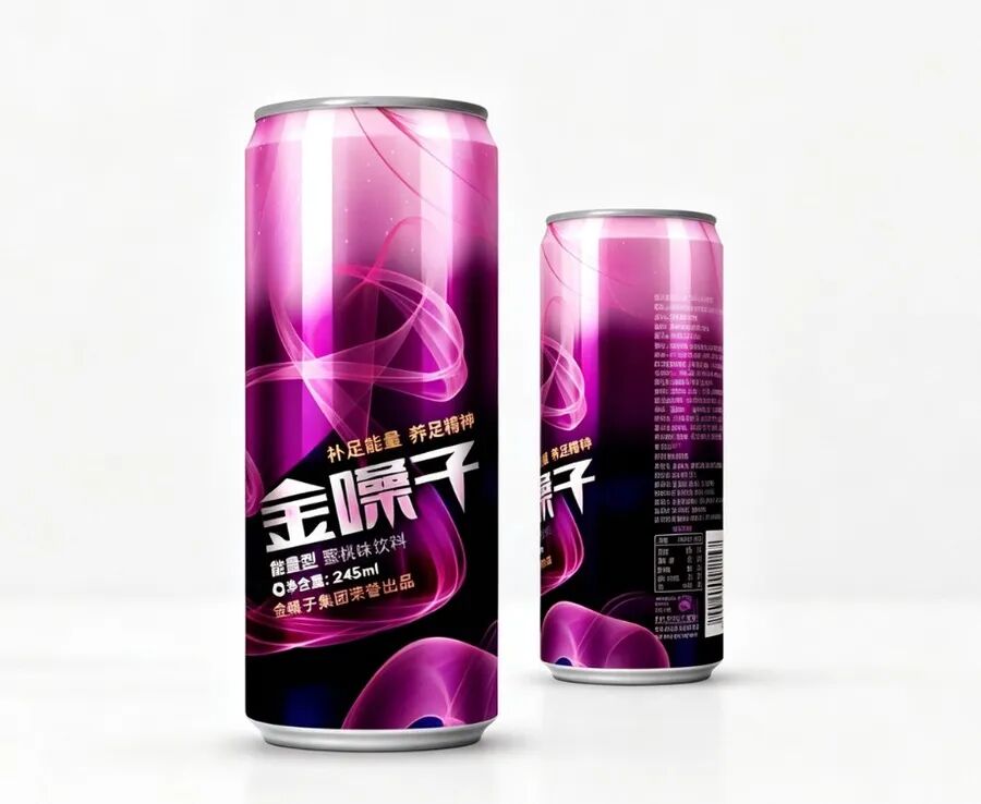
01_Product dual-can display.jpg
Isn’t [brand name] supposed to make throat lozenges? They’ve also come out with an energy drink. For this project on Xinjiedao, I thought there had been a mistake, but actually there is one: 245ml, peach flavor, energy type.
This move is interesting.
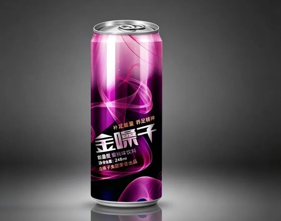
07_Dark single can.jpg
The energy drink market has long been dominated by Red Bull, Monster, Eastroc, and other “black-and-red” brands. What they want to express is: fierce, aggressive, able to stay up all night. So their packaging gets more aggressive one after another—lightning bolts, claw marks, bulls—making your adrenaline rise first.
But the designer didn’t do that. They used purple-red and added peach flavor.
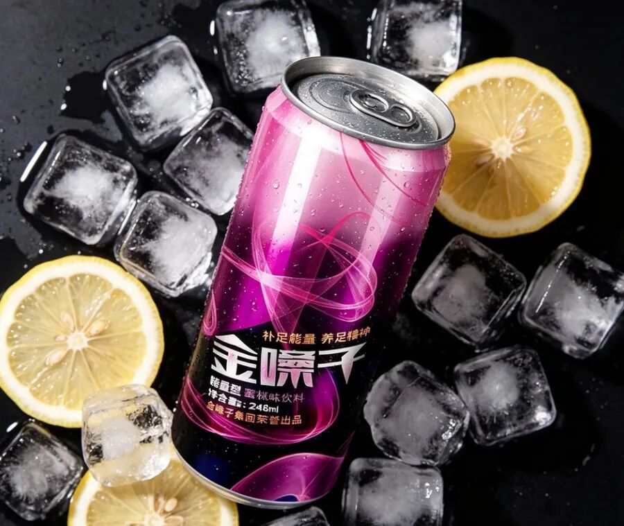
03_Ice cube lemon close-up.jpg
This color wasn’t chosen at random. Think about it: the main crowd for energy drinks isn’t just men working late; there’s also a large group of girls, fitness beginners, and office workers who get sleepy in the afternoon. When they see a black-and-red can, their first reaction is “this stuff is too harsh, I don’t dare drink it.” Purple-red plus peach lowers the threshold of energy drinks, making it feel like something “I can take a sip of too.”
And have you noticed? [brand name] has been making throat lozenges for so many years, and the deepest impression it leaves is “refreshing.” Peach flavor isn’t harsh, purple isn’t dry—it perfectly extends the brand’s original refreshing feeling to the drink. Cross-category isn’t starting from zero; it’s turning old trust into new permission.
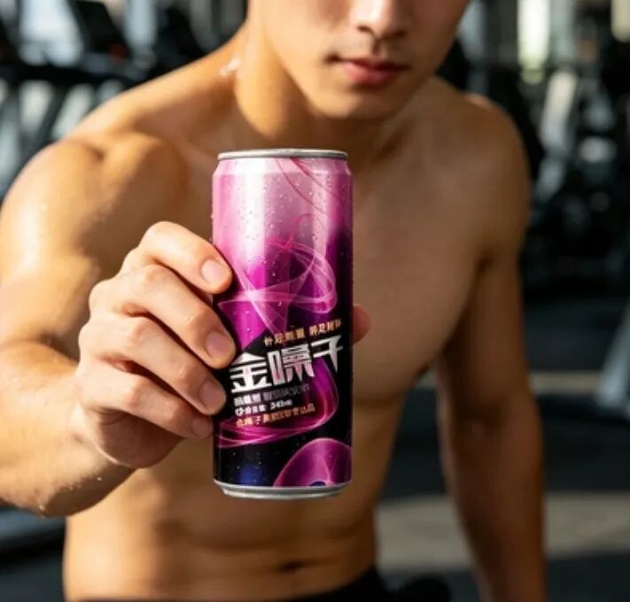
05_Gym handheld.jpg
And there’s a benefit—everyone recognizes it. Crossing from throat lozenges to drinks doesn’t require re-education. The three characters on the can are the biggest trust signal.
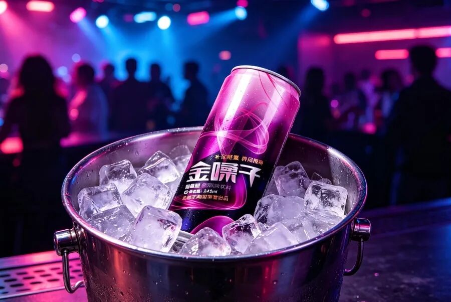
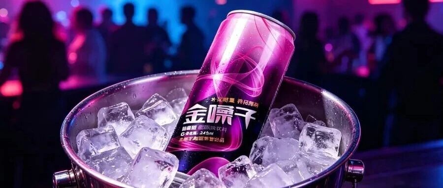
02_Nightclub ice bucket.jpg
The scenarios have expanded too. Placed in a nightclub ice bucket, it doesn’t lose to any foreign brand. It’s not the hardcore “I’m pulling an all-nighter tonight” style, but the relaxed “replenish some energy while having fun” vibe. This gap isn’t just about color; it’s about emotion.
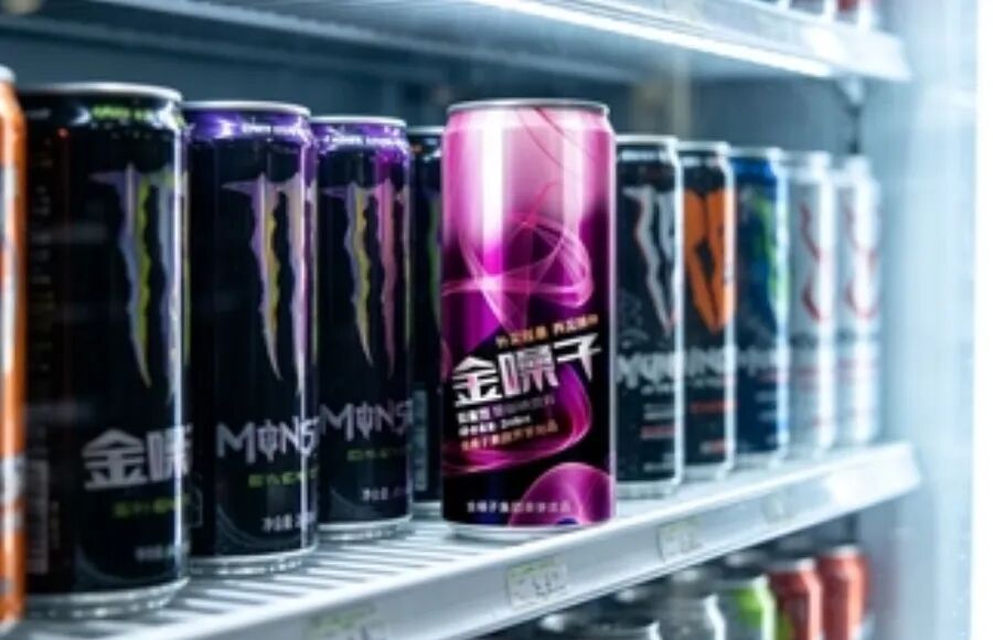
06_Convenience store cooler.jpg
Placed in a convenience store cooler, it’s even more obvious. Surrounded by black and red cans, it stands there in purple, and it’s hard for your eyes not to scan to it first. On the shelf, it’s not ugliness you fear; it’s lack of differentiation.
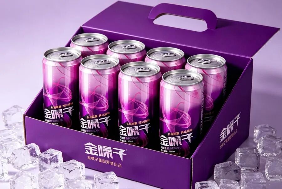
04_Gift box six-pack.jpg
The gift box is done without cutting corners either. Six cans in a pack, purple box with silver lettering—it’s not cheap-looking as a gift. Making an energy drink into a gift box shows it’s not just aiming to be a “functional drink” but also wants to enter social scenarios.
To put it plainly, this can of drink isn’t just selling energy; it’s selling the permission that “I can drink energy drinks too.”
Many bosses making products always think about looking like the leader. If Red Bull does it this way, I’ll do it this way—and end up dying on the shelf. What you should really think about is: what do the people the leader isn’t serving look like?
The biggest fear in packaging isn’t lack of design; it’s being designed to look like everyone else.
If you’re also making drinks or food and aren’t sure whether your packaging should be aggressive or soft, send me a picture, and I’ll help you run a packaging sales power score.
Sanyao Strategy & Design
8 years of packaging strategy · Wuhu, Anhui
WeChat: sanyaosheji | Phone: 18505532653
Packaging determines perceived pricing—your product deserves to be seen well
About This Case: Quick Answers
My product is good, but why should consumers believe it?
Trust is grown, not shouted. Break trust into visible details: real ingredients, restrained claims, traceable origin symbols. The less you boast about a function, the more buyers come to the conclusion themselves that "this stuff is reliable."
Can my beverage product use this "drink" playbook too?
Yes. This logic doesn't discriminate by category—as long as your product looks similar to others on the shelf and consumers can't recognize you in three seconds, it works. When it comes to implementation, we'll re-tailor the plan based on your category, channel, and price band, and won't force-fit someone else's face.
How do you usually charge for beverage packaging, and how long does it take?
We charge per project, depending on category complexity, number of series, and whether sampling extensions are included. Typically 2–4 weeks: the first week sets direction and positioning, the second week produces concepts, and the third and fourth weeks deepen, sample, and finalize. Rush orders can be compressed, but we recommend leaving time for physical samples. Send your materials first for a free diagnosis, then we'll quote.
We're not local—can we collaborate online?
Yes. Many of our projects are remote collaborations: materials are coordinated online, proposals are reviewed in the cloud, and samples are sent by courier. There are no geographical limits; we work with clients nationwide.
CommentsBe kind, communicate rationally