
Everyone knows they need to build a private domain, but who knows that in the end, private domain comes down to trust—and trust starts in those 3 seconds of unboxing, where packaging plays a crucial role!
Everyone knows they need to build a private domain, but who knows that in the end, private domain comes down to trust—and trust starts in those 3 seconds of unboxing, where packaging plays a crucial role!

Sanyao Packaging Design | Original packaging design for new products from 0 to 1. All images in this article are original works designed by our studio. Please credit the source when reposting!
A while back I came across a theory that's pretty good — "everything about private-domain monetization ultimately comes down to trust." That's quite an inspiration for those of us in the packaging strategy business.After years of doing packaging design, our understanding of that sentence may differ from that of internet people. When they talk about trust, they think about what to post on WeChat Moments and when to quote a price in a private chat. We think about an earlier moment — the few seconds when the package is opened and the consumer takes the product out of the box.
Those few seconds matter more than the hundred Moments posts you make afterward
There's a statistic that stuck with me: the follow rate on package insert cards ranges from 3% to 30% across the industry — a tenfold difference. It's said that 95% of package insert cards are poorly designed, because they pile on a bunch of incentives, while the buyer just wants to see the product when opening the package. If you can't spark interest in a few seconds, the card goes in the trash.
Apply that to packaging and not a single word needs changing.
We have a client that makes bayberry fruit wine, called Qinghe, 6% ABV, targeting young women. The initial proposal was very "full": red background, big type, full-bleed fruit illustrations — the boss thought that's what made it look valuable. Later we scrapped it all, keeping only the two characters "杨梅" (bayberry) in calligraphy, a single line-drawn crane, and a red seal, and put the entire saved budget into gold foil stamping.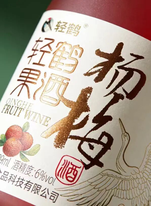 Qinghe bayberry fruit wine | off-white background + calligraphic “杨梅” + line-drawn crane + red seal, with the budget concentrated on gold foil stamping on the bottle
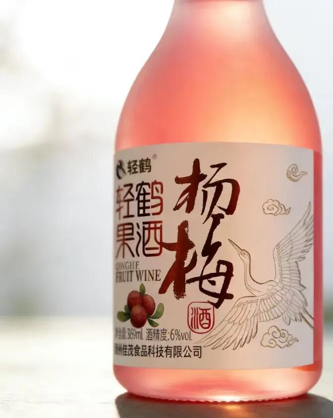 Qinghe bayberry fruit wine | frosted glass bottle, 6%vol / 360ml, a single crane turned into the brand’s memory symbol
It’s not about saving money. It’s about moving money from a place the user can’t even see to a place his fingers can touch.
We’ve discussed the matter of subtraction internally many times, and we’ve stepped in it too — one version left so much white space that from a meter away on the shelf you couldn’t tell what category it was. So subtraction isn’t “the less the better”; it’s “only remove the parts that don’t carry the main information.”
The contents themselves are the star — don’t cover them with illustrations
Yigu Yiyang’s corn juice is another direction. The orange-yellow color of the product itself is already eye-catching, so what we did wasn’t to add more visuals but to shrink the label area to the minimum, maximize the white space, and switch to a square bottle shape.
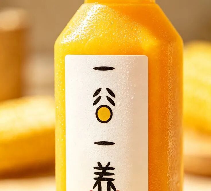 Yigu Yiyang fresh-pressed corn juice | 300ml square bottle, minimalist black-and-white label, letting the orange-yellow contents take the visual lead
 Yigu Yiyang fresh-pressed corn juice | warm-light handheld scene; the clear texture and “fresh-pressed” feel come from the photography, not the copy
The article talks about “less is more” and about how a product’s first appearance should immediately tell people “what you are.” Here it comes down to one sentence: if the contents themselves look good, illustrations are in the way.
Qijianke’s ten-year baijiu works on the opposite logic. The shelf for mid-to-high-end baijiu is a sea of festive red and gold, so we simply used an all-black ceramic bottle, pushed the most valuable piece of information — “ten years” — to the very front of the main visual, and used the contrast of material and color to carve out a space in the red shelf.
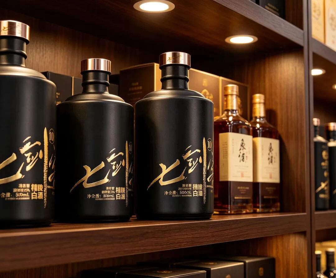 Qijianke ten-year baijiu | 500ml matte black ceramic bottle, gold cap pressing down on the black body, creating visual contrast on the red-and-gold shelf
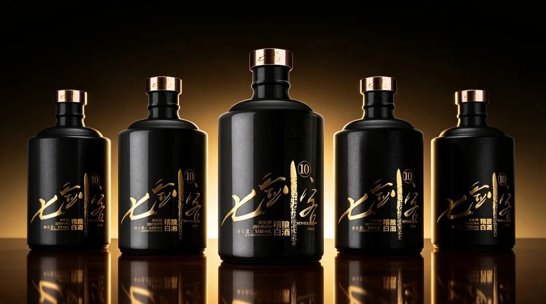 Qijianke ten-year baijiu | gold foil label + gold calligraphic product name, with “ten years” pushed to the very front of the main visual
Three cases, three approaches, but the underlying judgment is the same: in this one second, what should the consumer see most? Once you’ve thought that through, what’s left is craft and aesthetics.
Local specialties — don’t rush to “whitewash” them
Bishiju’s Northeast pickled cabbage is a project that made me revise my thinking once.
The first draft we did was very fresh and clean — pastoral feel, light tones, fine lines — thinking that’s what made it look classy. The client said nothing when he saw it, and later we reviewed it ourselves: this thing is inherently Northeast New Year flavor; if you whitewash it into a Jiangnan-style fresh-and-clean look, it’s neither like a specialty nor like a high-end product.
In the end we went with “expressing the rustic in a disciplined way” — the bag version for everyday dining tables, the box version for gifting occasions, one product in two forms. Being rustic isn’t shameful; being rustic without discipline is.
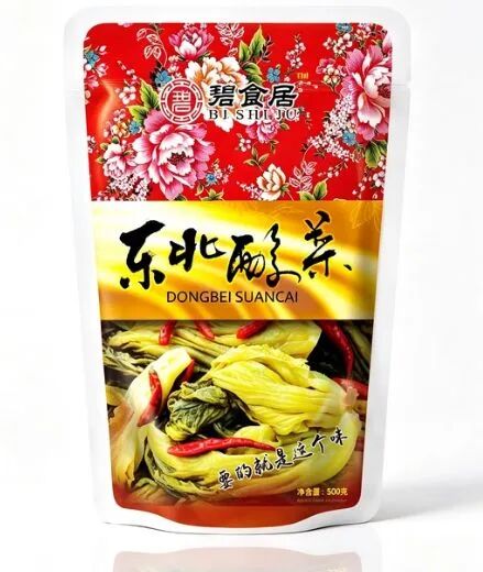 Bishiju Northeast pickled cabbage | 500g aluminum foil bag, true red background + vintage peony + realistic food image, the bag version for everyday dining tables
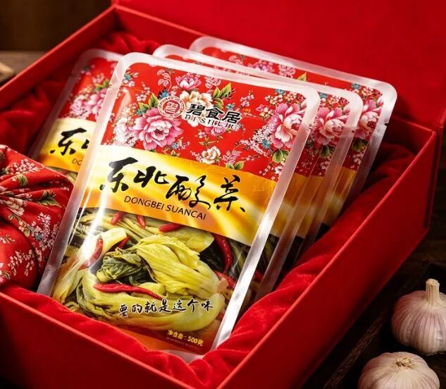 Bishiju Northeast pickled cabbage | red gift box displaying the bag inside, the same product cutting into the New Year gifting occasion
A few less pleasant words
For the packaging design industry, the lesson of private domain isn’t “packaging needs a QR code” — it’s that packaging has taken on a task that didn’t used to belong to it: it is the physical touchpoint where the product and the user build their first trust.
But not every product should have hooks stuffed into its packaging. High repeat purchase, high ticket, high service — we’ve used it, and we’ve also met clients it doesn’t suit: one-time purchases, low ticket, pure distribution goods. Force a scratch-card into it and the conversion rate won’t improve just because the design looks good — it’ll only make the cost sheet uglier.
So every time a client asks “can we add something to the packaging to drive traffic,” we usually ask two questions first: how long is your repeat purchase cycle? Is the person opening the box the final decision-maker?
Is this decision one to add?
Sanyao Packaging Design | Original packaging design for new products from 0 to 1
About This Case: Quick Answers
How exactly does a product get "seen" on the shelf?
Consumers give you only three seconds in front of the shelf. The most reliable approach is to design on two levels: beyond three meters, grab attention with color and shape; within one meter, stop people with information and cultural trust signals. The root cause of most products that don't sell isn't that they're bad—it's that the "good" never gets shouted out from three meters away.
Can my product use the same approach as "Qinghe"?
Yes. This logic isn't tied to any category—it works as long as your product looks much like everyone else's on the shelf and consumers can't recognize you in three seconds. When it comes to execution, we'll build a new plan around your category, channel, and price band rather than forcing someone else's face onto yours.
What do you generally charge for product packaging, and how long does it take?
We charge per project, depending on category complexity, the number of series, and whether prototyping and extensions are included. Typically 2–4 weeks: the first week sets direction and positioning, the second week delivers concepts, and the third and fourth weeks deepen, prototype, and finalize. Rush timelines can be compressed, but we recommend leaving time for physical prototyping. Send us your materials for a free diagnosis before we quote.
We're based elsewhere—can we work together online?
Yes. Many of our projects are remote collaborations: materials are coordinated online, concepts are reviewed in the cloud, and prototypes are shipped by courier. There are no geographic limits—we work with clients nationwide.
CommentsBe kind, communicate rationally